Data visualization has given a significant benefit for visualizing a large set of data. Heatmap is one such data visualization method that comes under the Seaborn Python package. Heatmaps are the graphical representation of values depicted using various shades. The color shades remain the same for each value when plotted.
Seaborn for Data Visualization
Seaborn is a popular data visualization library, which is based on Matplotlib. It renders high-end graphical figures and organized methods for presenting engaging statistical graphics. Since Seaborn is built on top of the Matplotlib library, there is a possibility of further tweaking the graphics through Matplotlib methods for enhanced graphics.
Heatmaps and its use:
Heatmaps are the 2D graphical representation of different values residing in a matrix form. The seaborn Python package allows data analysts to create annotated heatmaps. When there is an increase in the value or data that shows higher activities, brighter colors like reddish or blueish shades get preferred. To use heatmap for visualization, import Seaborn library and then use the seaborn.heatmap() function. We use heatmaps when we want to describe the weight, variance, strength & concentration of data, visualize patterns, the intensity of action, and anomalies.
Syntax:
heatmap(<data-value>, *, vmin = None, vmax = None, cmap = None, center = None, annot_kws = None, linewidths = 0, linecolor = ’<colorcode>’, cbar = <True/False>)
Here parameters:
- data-value: It is a 2-dimensional dataset coerced into a ndarray.
- vmin, vmax: These are values anchored to the colormap as arguments.
- cmap: It maps data from data values to color space.
- center: It holds the value that is center the colormap while plotting divergent data.
- annot: This is set to True and is used for writing the data value in each cell.
- fmt: This is a string formatting code useful for adding annotations.
- linewidths: This represents the width of the lines dividing each cell of the heatmap.
- linecolor: This represents the color of the lines dividing each cell.
- cbar: If this value is True, it will draw a color-bar.
Program:
import numpy as np
import seaborn as sb
import matplotlib.pyplot as plt
# generate a 2D matrix of size 12 x 12 using random integer numbers
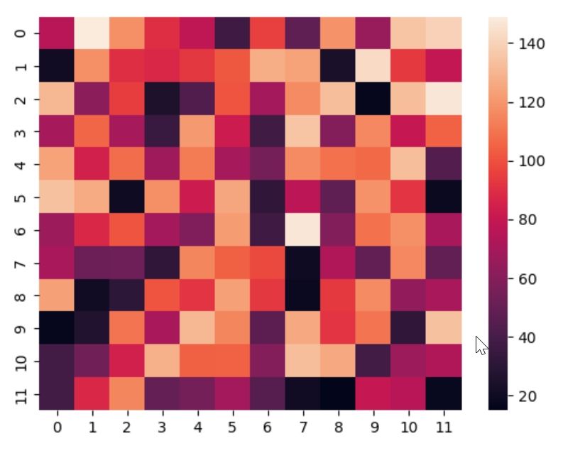
val = np.random.randint(low = 15, high = 150, size = (12, 12))
print("Here is the data to be plotted in matrix form :\n")
print(val)
# plotting the heatmap
heatm = sb.heatmap(data = val)
# using show method to plot the calculated heatmap
plt.show()
Output:
Here is the data to be plotted in matrix form :

[[ 76 149 118 90 78 37 96 48 119 66 135 140]
[ 21 118 90 88 93 102 128 124 24 143 94 79]
[131 62 95 25 43 101 69 117 133 17 133 147]
[ 70 106 70 35 121 82 38 135 60 116 80 105]
[124 85 108 68 112 70 55 117 109 107 133 44]
[134 127 20 118 82 125 32 77 48 119 92 19]
[ 67 88 101 69 58 122 37 147 59 109 118 71]
[ 71 52 53 32 115 104 98 20 73 49 116 49]
[123 21 31 101 92 123 93 19 94 117 64 71]
[ 17 27 110 71 131 115 47 126 92 110 32 134]
[ 39 54 85 129 104 105 60 133 126 39 67 73]
[ 39 88 115 50 55 69 45 21 15 80 76 18]]

Customizing Heatmaps:
Colors are the most critical and appealing part of a visualization chart. If you want to plot the heatmap with a single color shade, change the cmap value like this:
heatm = sb.heatmap(data = val, cmap = "Blues")
heatm = sb.heatmap(data = val, cmap = "tab20")
Labeling:
A data analyst can also customize the heatmap by tweaking the ticks on the x and y-axis. Bringing the ticks to the bottom and adding labeled names to the chart will make your chart look more like a presentation.
val = np.random.randint(low = 15, high =150, size=(12, 12))
# plotting the heatmap
xtick = ['Jan', 'Feb', 'Mar', 'Apr', 'May', 'Jun',
'Jul', 'Aug', 'Sep', 'Oct', 'Nov', 'Dec']
heatm = sb.heatmap(data = val, xticklabels = xtick,
yticklabels = False)
# using show method to plot the calculated heatmap
plt.show()
Centering the Heatmap:
It will center down the colormap when we need to plot divergent data. For this, pass the center attribute with the value center.
heatm = sb.heatmap(data=val,
cmap="Blues",
center = center)
Customized lines:
Data analysts can change the thickness and the line color that separates the cells as per requirement. For this, include value to the linewidths and linecolor parameters.
heatm = sb.heatmap(data=val,
cmap=cmap,
linewidths = 2.5,
linecolor = "green")
Disable color bars and remove labels:
To disable the color bars, set cbar parameter to False. To remove labels, set the x-label and y-label values using xticklabels and yticklabels parameters to False.
heatm = sb.heatmap(data = val,
xticklabels = False,
yticklabels = False)
Correlation Matrix:
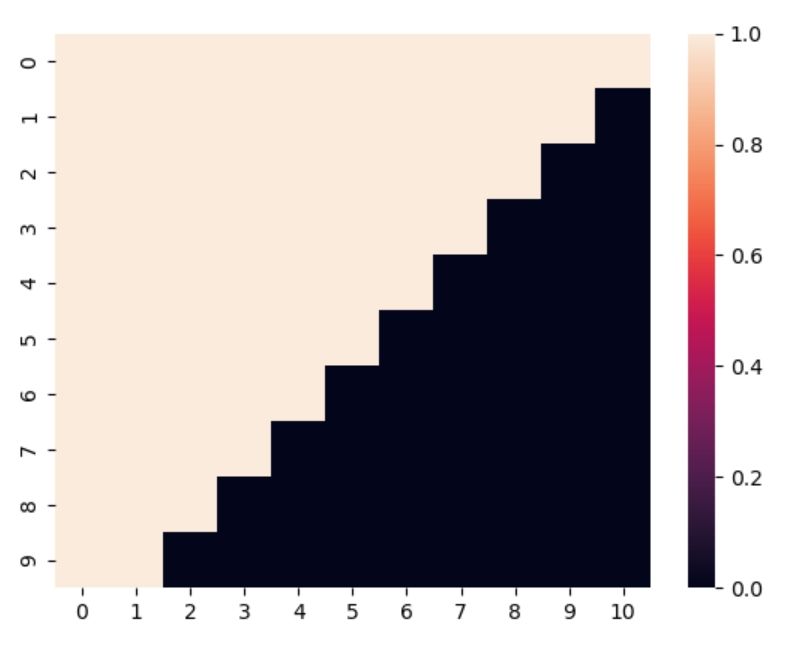
It is a matrix-based table that will represent a correlation among the data. There can be a lot of redundancy in the correlation matrix. For this, you can use the masking feature. Luckily, we can use the masking concept with Seaborn’s heatmap. Also, we need the NumPy array() to build one.
import numpy as np
import seaborn as sb
import matplotlib.pyplot as plt
val = np.array([[True, True, True, True, True, True, True, True, True, True, True],
                	[True, True, True, True, True, True, True, True, True, True, False],
[True, True, True, True, True, True, True, True, True, False, False],
[True, True, True, True, True, True, True, True, False, False, False],
[True, True, True, True, True, True, True, False, False, False, False],
[True, True, True, True, True, True, False, False, False, False, False],
[True, True, True, True, True, False, False, False, False, False, False],
[True, True, True, True, False, False, False, False, False, False, False],
[True, True, True, False, False, False, False, False, False, False, False],
[True, True, False, False, False, False, False, False, False, False, False]])
print("Here is the data to be plotted in matrix form :\n")
print(val)
# plotting the heatmap
heatm = sb.heatmap(data = val)
# using show method to plot the calculated heatmap
plt.show()
Output:
Here is the data to be plotted in matrix form :

[[ True  True  True  True  True  True  True  True  True  True  True]
 [ True  True  True  True  True  True  True  True  True  True False]
 [ True  True  True  True  True  True  True  True  True False False]
 [ True  True  True  True  True  True  True  True False False False]
 [ True  True  True  True  True  True  True False False False False]
 [ True  True  True  True  True  True False False False False False]
 [ True  True  True  True  True False False False False False False]
 [ True  True  True  True False False False False False False False]
 [ True  True  True False False False False False False False False]
 [ True  True False False False False False False False False False]]

Annotated Heatmaps:
Annotated Heatmaps are another vital form of a heatmap that shows added information correlated with data values and cells of the heatmap. It represents values through rows of grids where we can compare multiple metrics.
import matplotlib.pyplot as plt
import seaborn as sb
sb.set()
# flights dataset is a predefined dataset
flights_val = sb.load_dataset("flights")
flights = flights_val.pivot("month", "year", "passengers")
# Annotated heatmap that shows numeric values on each data-cell
f, ax = plt.subplots(figsize = (9, 6))
sb.heatmap(flights, annot = True, cmap = "tab10", fmt="d", linewidths = .5, ax=ax)
Conclusion:
Heatmaps help in better illustrating density-based visual analysis. Although, as an alternative, we can use scatter plots. But they tend to become hard to comprehend if we have much data. With the increase in data, scatter plot points start to overlap and that is where heatmaps become beneficial.